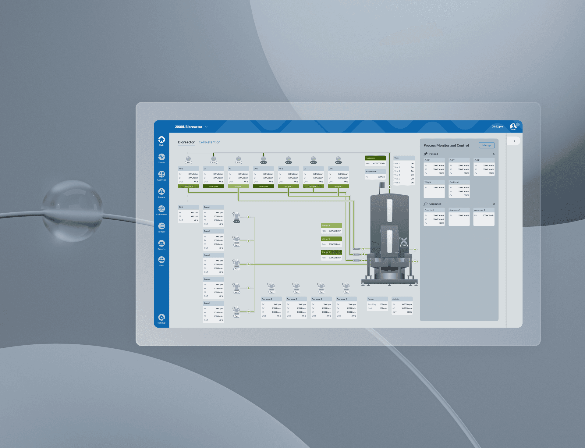
Integrated Perfusion Bioreactor HMI
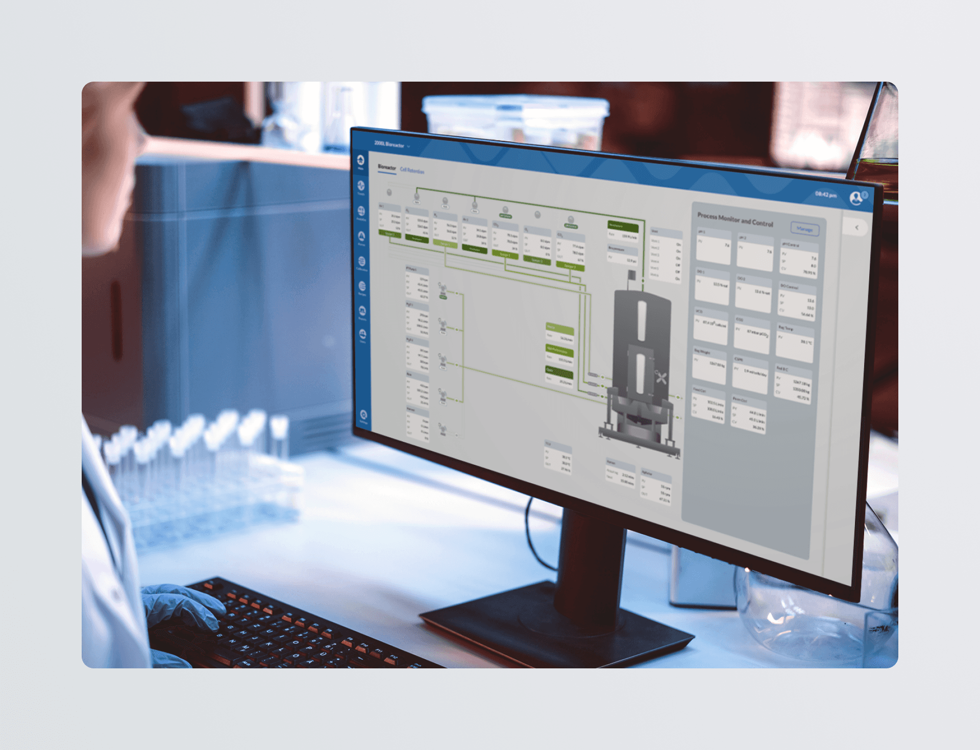
Perfusion is a company in the biotechnology space working on updating their HMI for a bioreactor system. When they came to us, they needed a complete rehaul and update to their design system and controller experience.
Service
UI Design, UX Design, Design Systems, HMI
Industry
Biotechnology, Pharmaceuticals
Timeline
2020
Catching Perfusion up to modern design standards
When we briefed with the client on this project, we quickly understood that our users were using outdated software from the 80's. Design language and convention has evolved since then, and we found many pain points in old and convoluted UX patterns and visual design.
Reinventing new interaction patterns was not the task. We were asked to update their existing system to meet modern design standards and conventions, making the transition between their phones, laptops, and the Perfusion HMI more seamless and less jarring.
Task at hand
Distilling complex systems into intuitive experiences
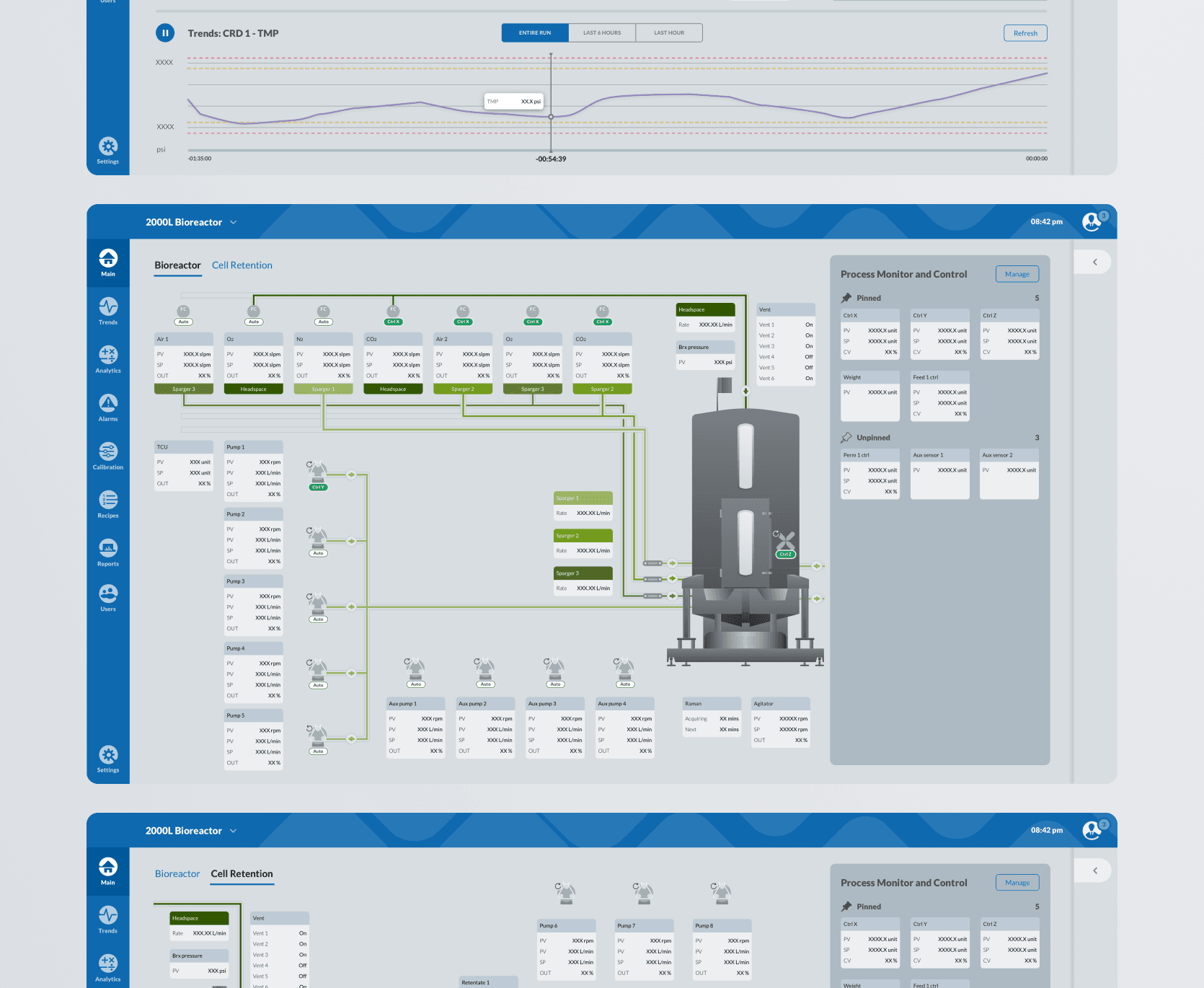
Bioreactors are often very complex systems with lots of moving parts. Operators and scientists have to juggle multiple data streams and visuals to understand their daily tasks. I worked with our team (a senior UI designer, a senior UX designer, and our director) to immerse ourselves in this system and make sure every line, color, and touch target was usable and intuitive.
Contribution
Alarms - balancing semantic color usage
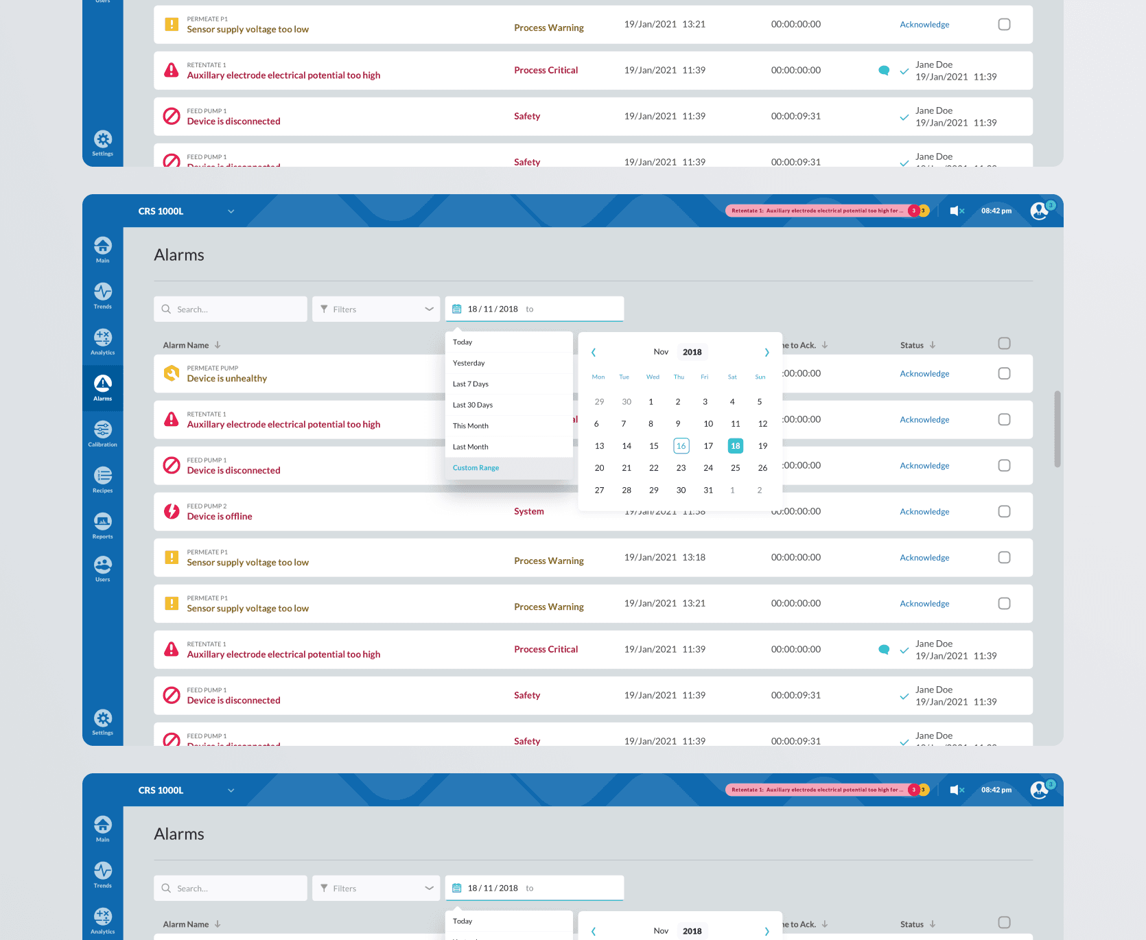
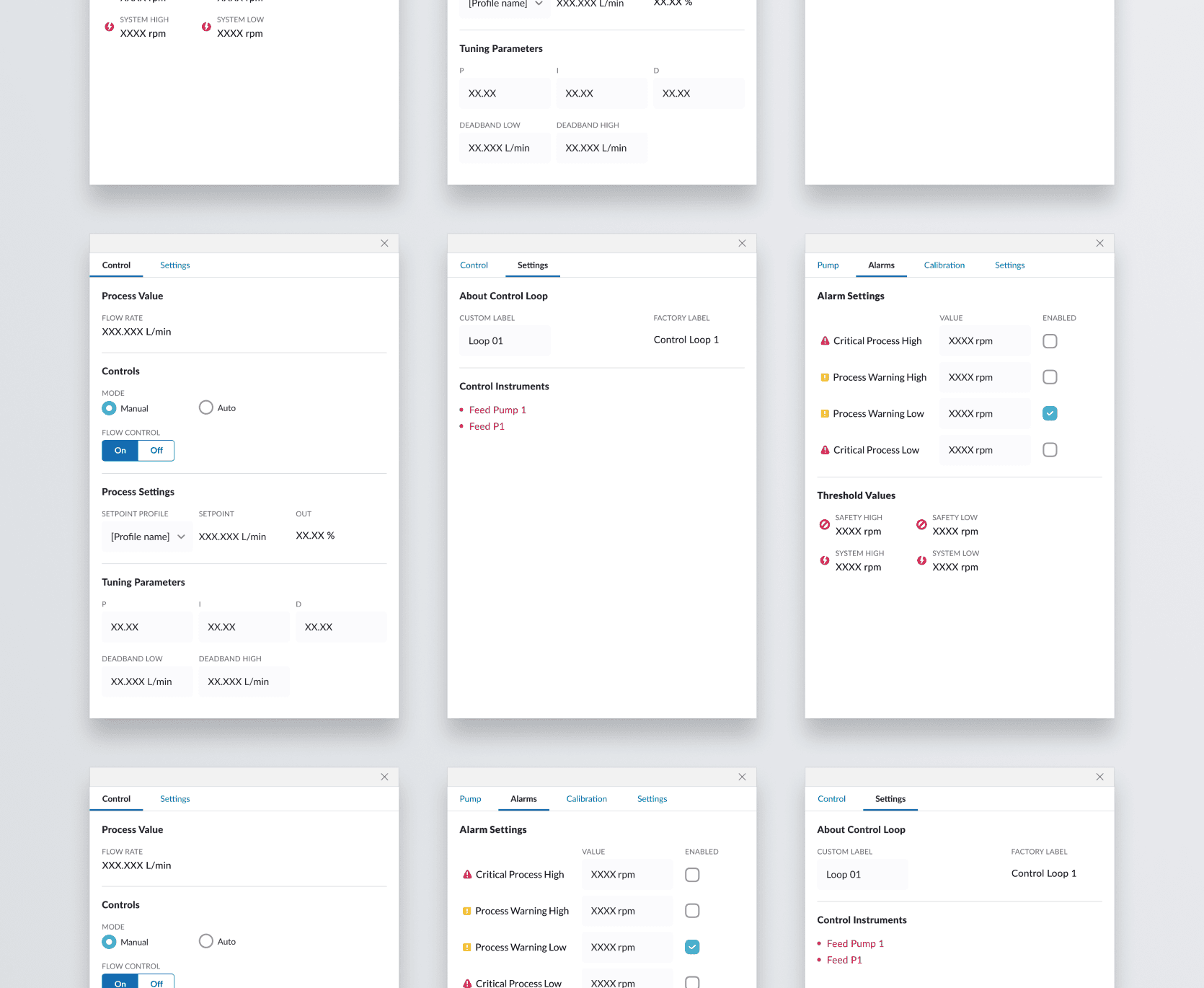
I owned the Alarms and Alarm dashboard workstream. We had to ensure that when something went wrong, was about to go wrong, or became critically dangerous, our operators and scientists knew exactly what was happening. This system balanced colors, icons, and animations into an organized dashboard that ensured the user could trace and follow all available info.
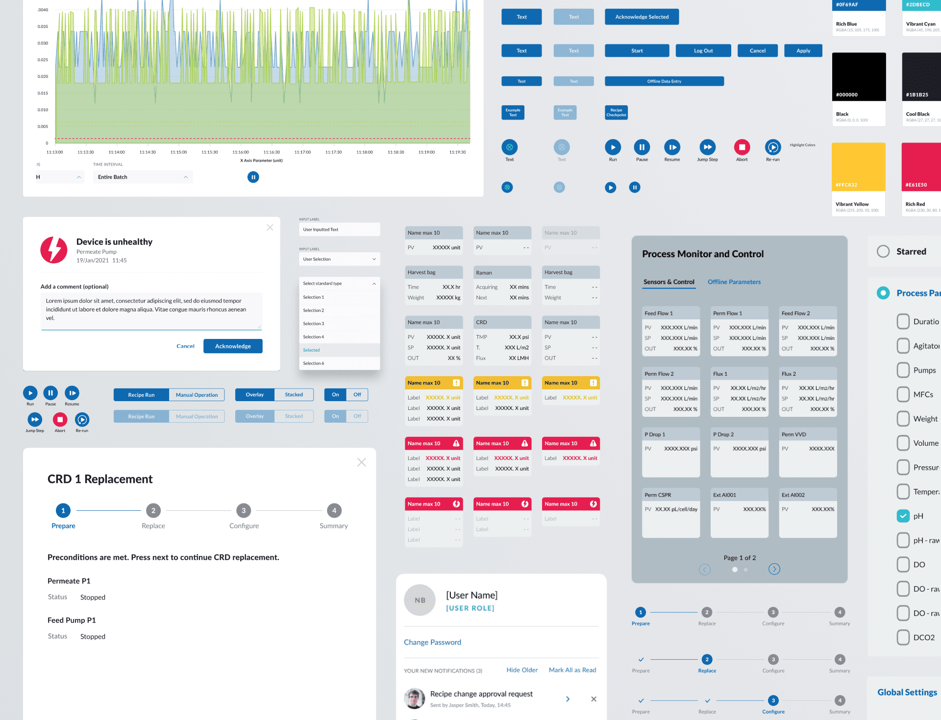
Designing the alarm system had cascading repercussions for what notifications, messages, and card states looked like across the system. We maintained a very neutral and muted blue palette to make sure the alarm states were as clear as they could be.
Contribution
Trends - the challenge of interactive data visualization
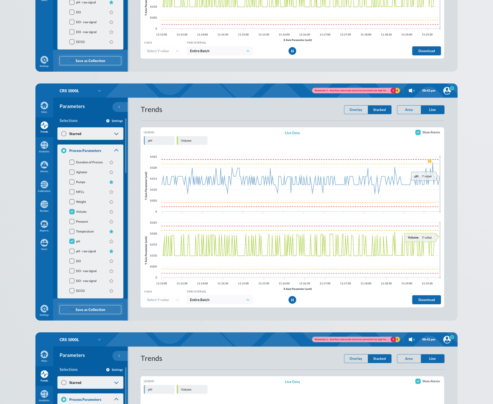
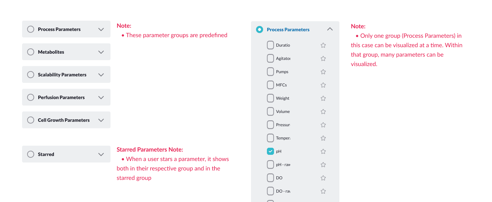
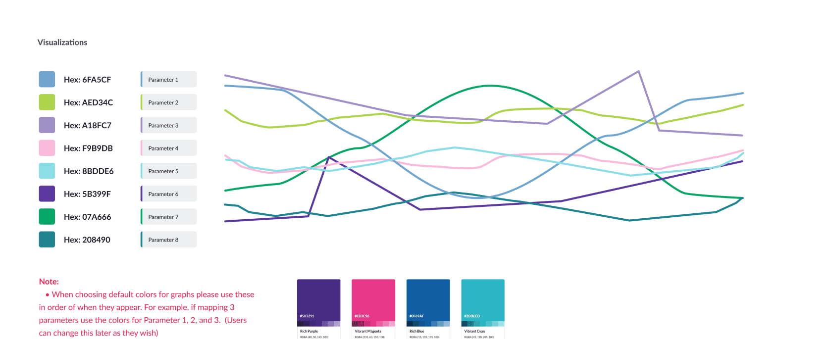
Another workstream I owned was called Trends. As part of their work, scientists and operators needed to visualize the changes and fluctuations of a parameter over weeks, days, or even hours. For example, they might want to see the pH level of a certain batch across a week to see if the pH ever exceeded the limits they had set in the system. This vital information was a challenging task to visualize, because we had to balance layering of colors, numbers, and even motion. We landed on a system that was clear and built on the existing language we had already set up in Alarms.
Takeaway
Meeting developers where they were
The developers and tech team we worked with at Perfusion were not incredibly familiar with working with designers. Our tools, language, and flows were a bit foreign to them. Across the year that we worked on this project, and through many iterations and learnings, we had to adapt our design documents to be as useful and usable to them as possible.
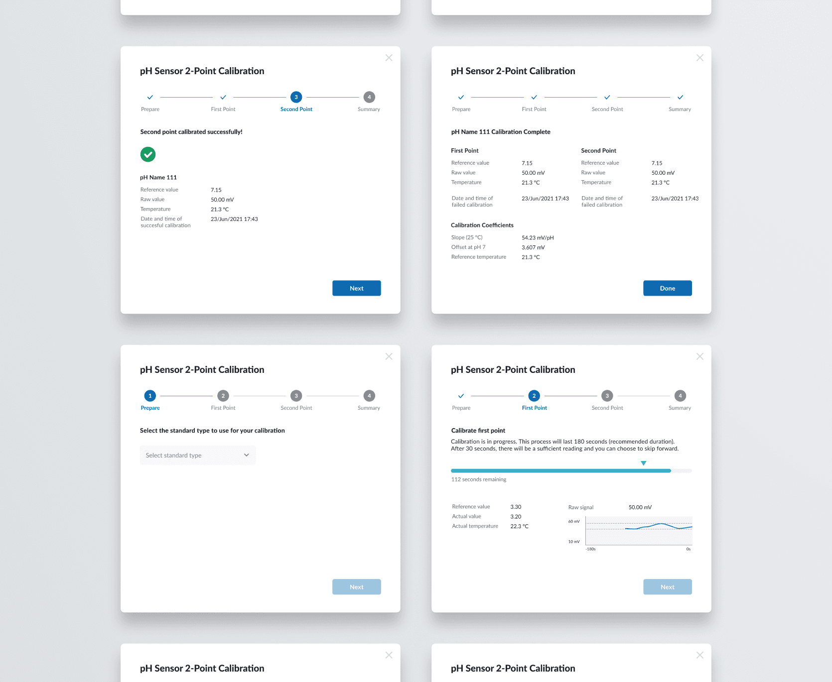
This meant calling out edge cases, default behavior, spacing, error states, and laying out every individual asset and layer.
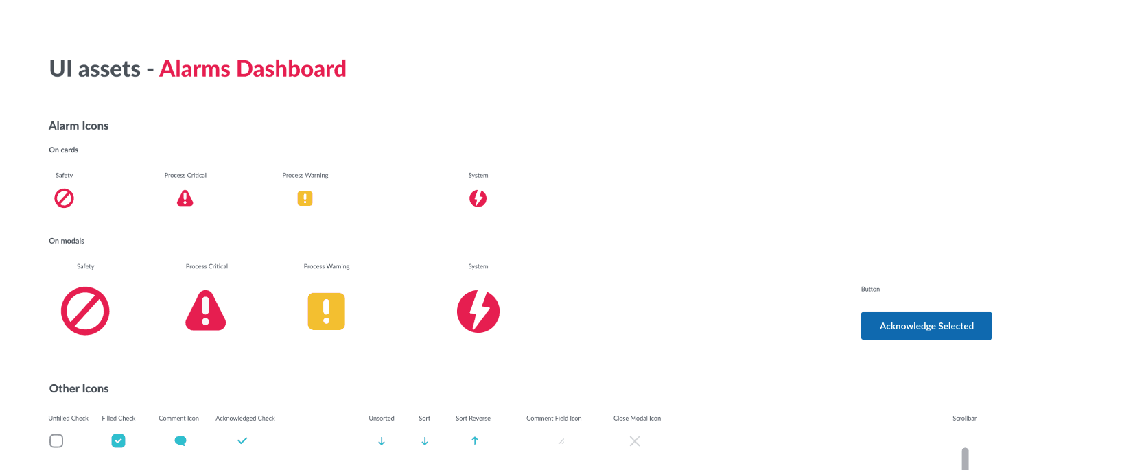

I worked with my team to deliver a user-friendly design system and screens the Perfusion team could implement. I owned the UX and UI design of 2 complex areas of the HMI experience. I worked with my team and the Perfusion developer team to find a design handoff method that worked best for all parties.
MORE PROJECTS
