Calculator 2: The Game
A sequel to the beloved original math puzzler. With Calculator 2: The Game, we wanted to bring back what worked so well in the first game but add some new twists, gameplay mechanics, and a fresh look.
Service
UI Design, UX Design, Visual Design, Game Design
Industry
Mobile Games
Timeline
2018
Featured puzzle game in 2018
Breathing new life into an old classic
I've always been a fan of math and a fan of puzzle games, so when the team let me lead this project I was ecstatic. I knew I wanted to pay homage to the original game but still pull in some new twists and my own personal style. To build this game I worked with a pixel artist for game animations and a level designer to help create our 200 levels. As a designer and developer, I was in charge of UI design and implementation in Unity.
Task at hand
Turning an unreleased game mode into a fully fledged game
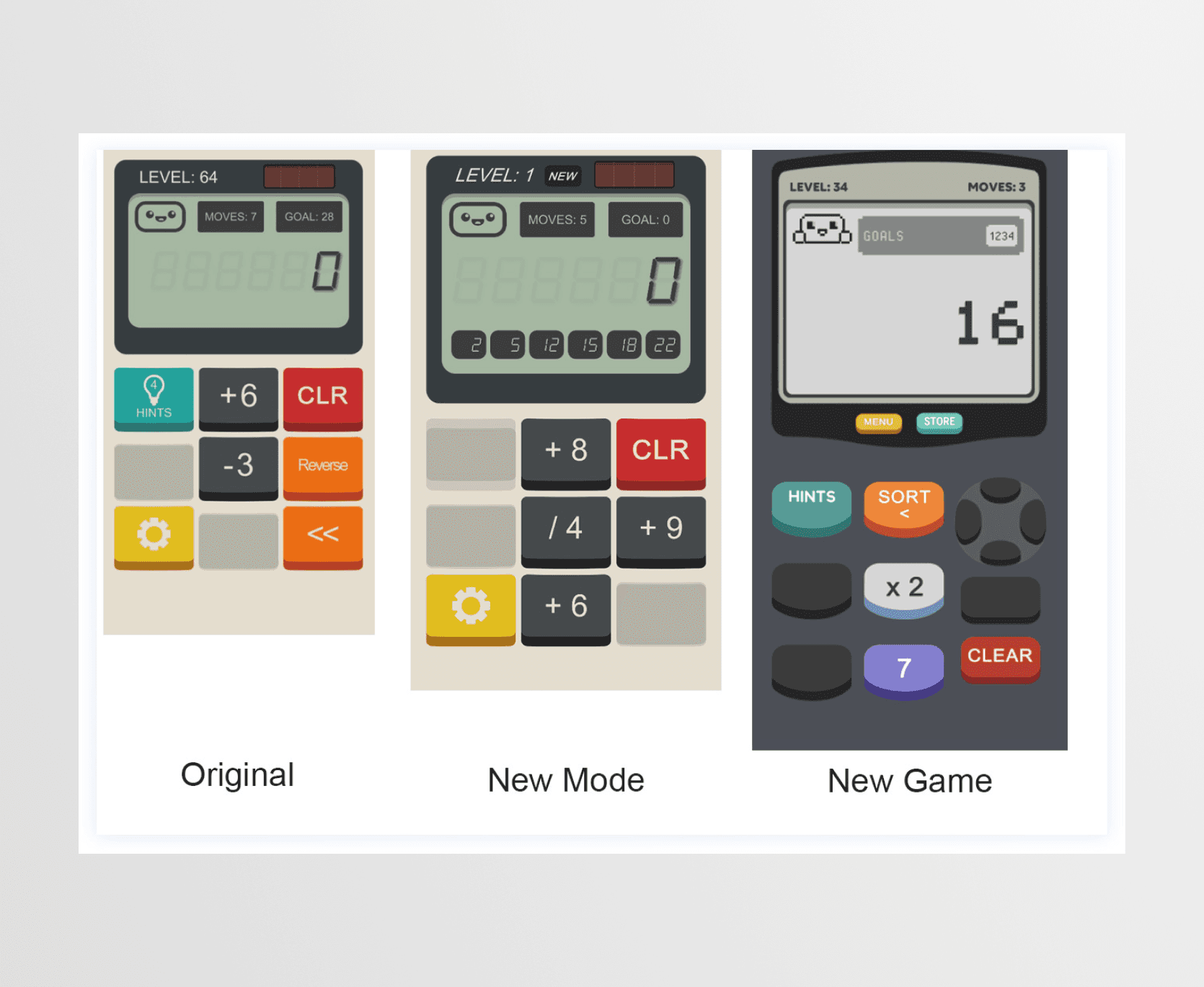
While developing the original game, we tested and developed many different game mechanics, buttons, modes, that didn't make it into the final cut. One mode that tested really well internally and with our beta testers was this idea of a multi-goal level. In the original, the gameplay loop required players to get from point A to B in a set number of steps. In the new mode that ended up becoming the base for the second game we asked players to get from A to B, C, D, and E along the way as well.
Process
Research led to skeuomorphic familiarity
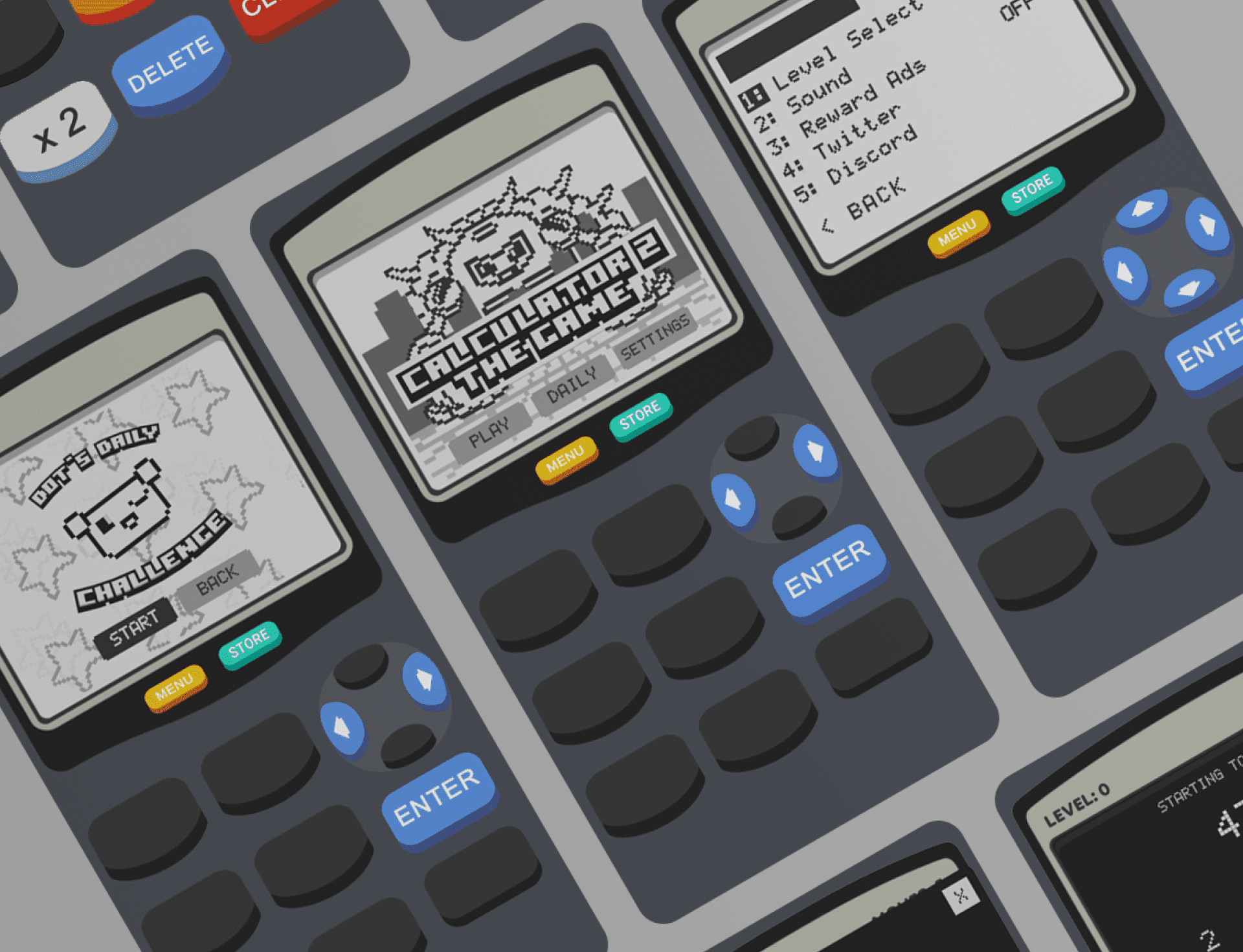
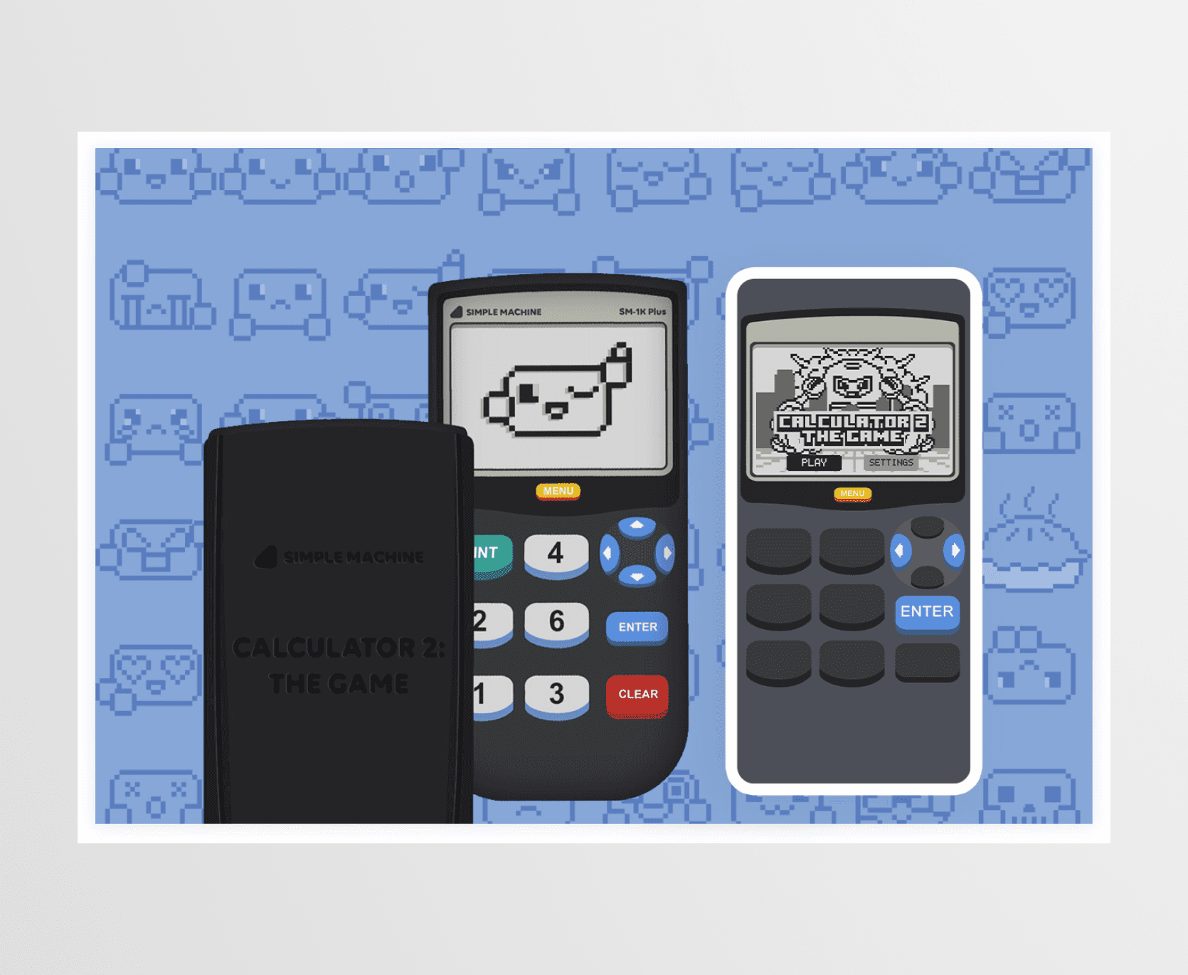
We carried the skeuomorphic visual identity from the first into the second but did some research on the iconic TI style scientific calculators as our inspiration. We wanted the game to feel familiar and evoke that nostalgic feeling of sitting in your math class playing games on your calculator to pass the time. Button styles, type, and colors, were refreshed in the sequel.
Takeaway
Give players a chance to learn by playing
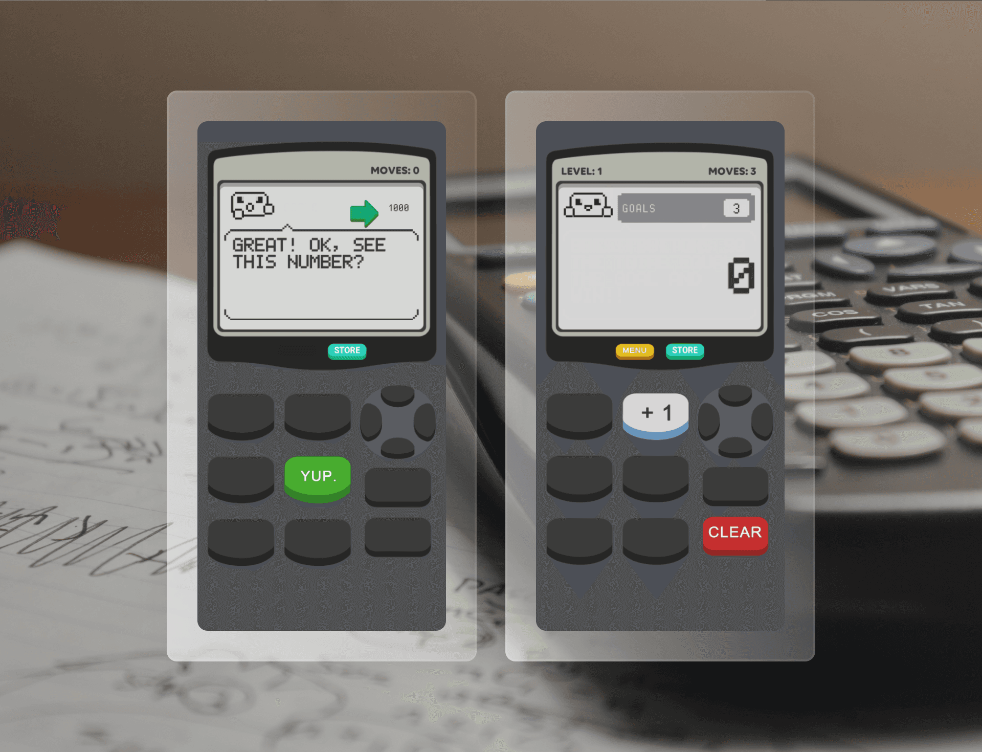
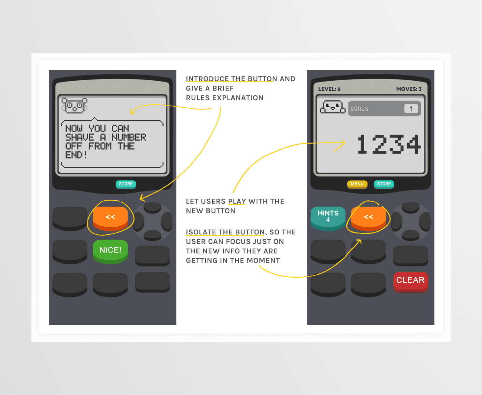
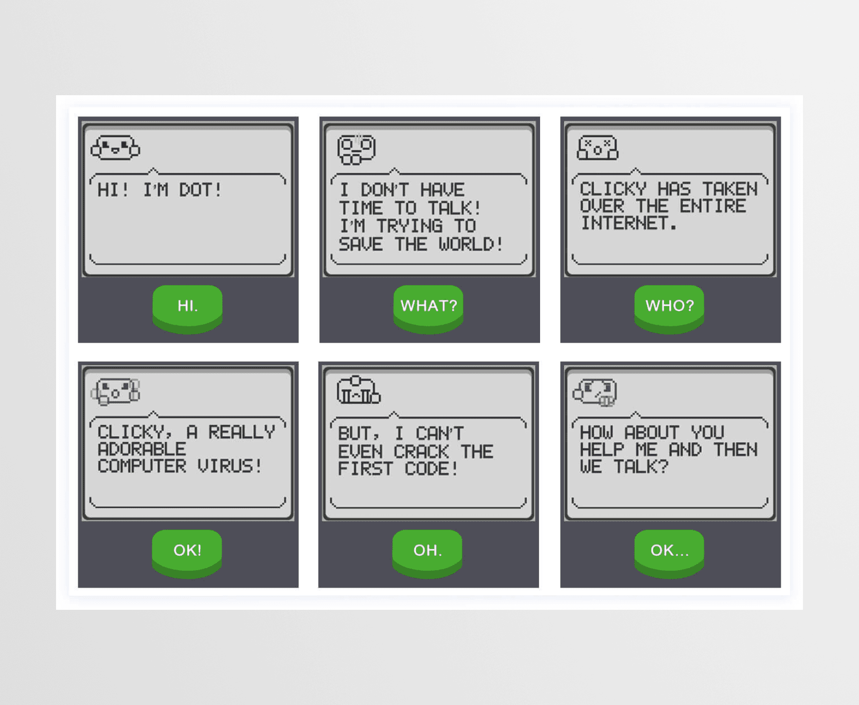
Our team tried many different tutorial methods. We learned that rules explanations, examples, and videos were only successful to a degree. When we started designing "tutorial levels" for each button we got very positive feedback from our testers. This approach ended up being how we structured all 200 levels. We would introduce a game mechanic, let players play with it for a couple levels, and then start upping the complexity until we introduced a new mechanic.
As lead game designer and developer on this project, I designed the visuals, developed the game experience, and worked with a level designer and pixel artist to bring the rest of the game to life.
MORE PROJECTS
