Cryometry - Kitchen Companion App
Cryometry is a food science and technology brand working on bringing a smarter kitchen appliance to the market. As the lead designer on the team, I had a big hand in building their design system. For the past 3 years, I've been maintaining, scaling, and using it to design their digital companion app.
Service
UI Design, Visual Design, Design Systems, Mobile
Industry
Connected Technology, Home Appliances
Timeline
2021 - 2024
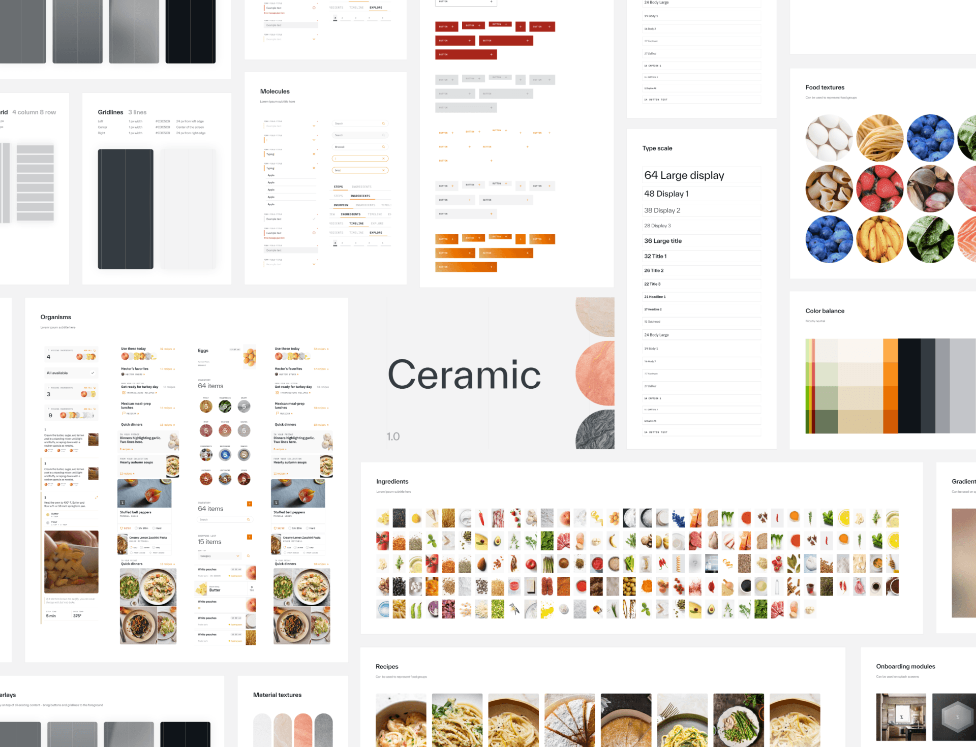
Ceramic - a robust design system built to last
We built a design system from the ground up that factored in previous material, technical feasibility, and scalability. The design system, Ceramic, is still being used today.
The design system:
features 32+ Figma pages, (including atoms, molecules, organisms, and templates)
is being used to build 10+ different workstreams
has been touched by designers, developers, and strategists
has been maintained and updated for the past 3 years
Task at hand
Laying the groundwork for a design system
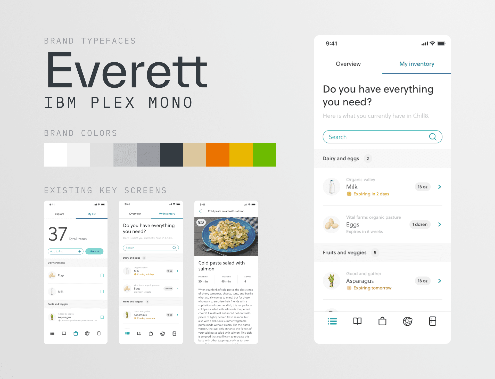
When I joined Cryometry, they had an established corporate identity (logos, type, colors, and key screens) but lacked a design system that could be scaled out to digital surfaces. Our team was tasked with laying the groundwork for the digital companion app.
Approach
Landing on a new visual direction
My approach while discovering a new visual direction was to find inspiration and land on an overall direction that the team would be happy to pursue. I found inspiration in cooking, kitchen materials, and food science—all key aspects of the Cryometry brand ethos.
Below you can see some visual mood boards I created to help inspire and find alignment within the team.
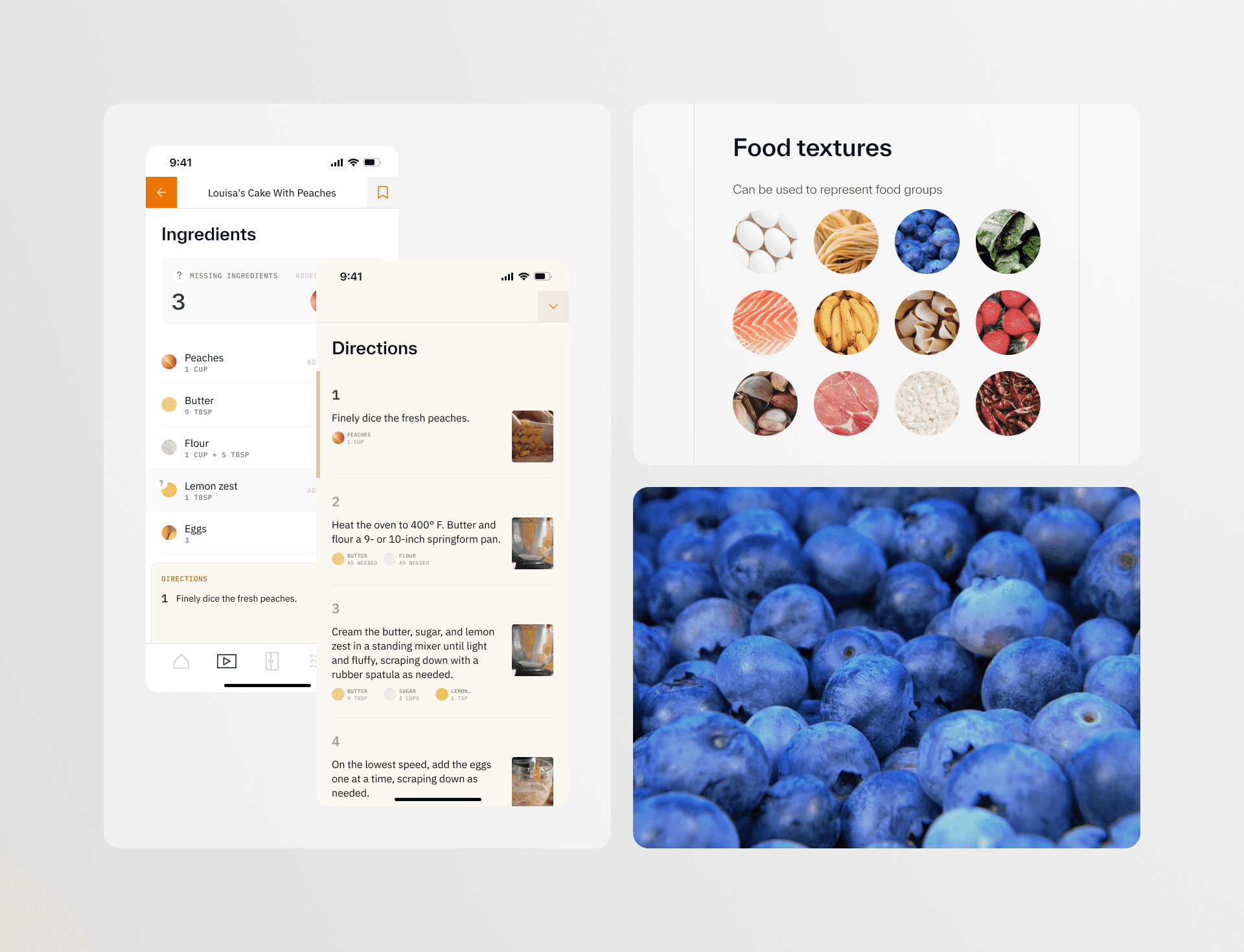
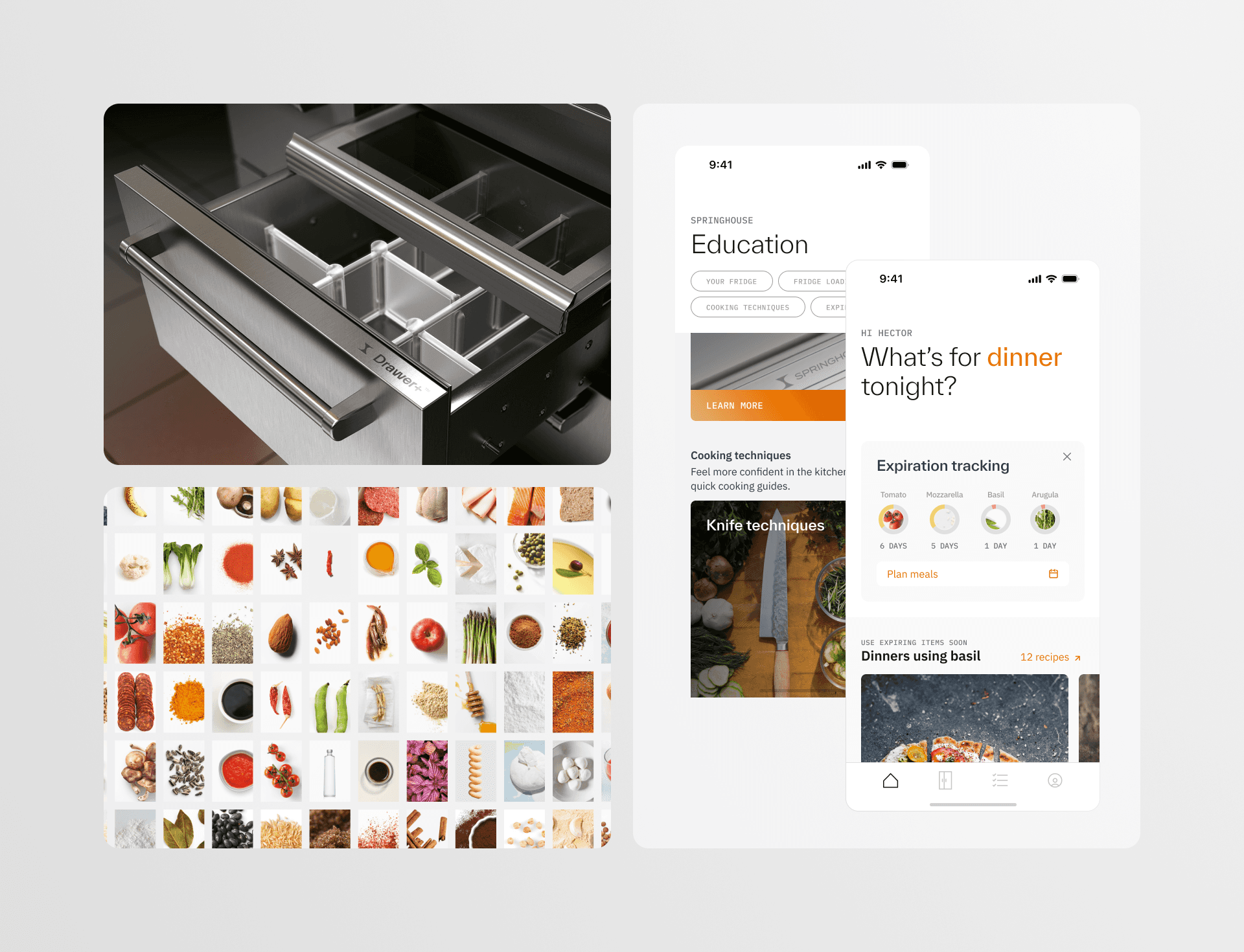
I looked to common textures, materials, and imagery a consumer might encounter in the kitchen (Cast iron, enamel, ceramic, fire, and ingredients). Cryometry wanted to appear elegant but backed by science. To translate this visually, I explored gridlines and macro-photography.
Takeaway
Balance blue sky thinking with real-world constraints
What I love about the early visual design process is the explorative and often messy nature of it. While visionary approaches like blue sky thinking can inspire the team's creativity, they often don't account for real-world constraints, such as technical feasibility, timeline, budget, and varying designer sensibilities.
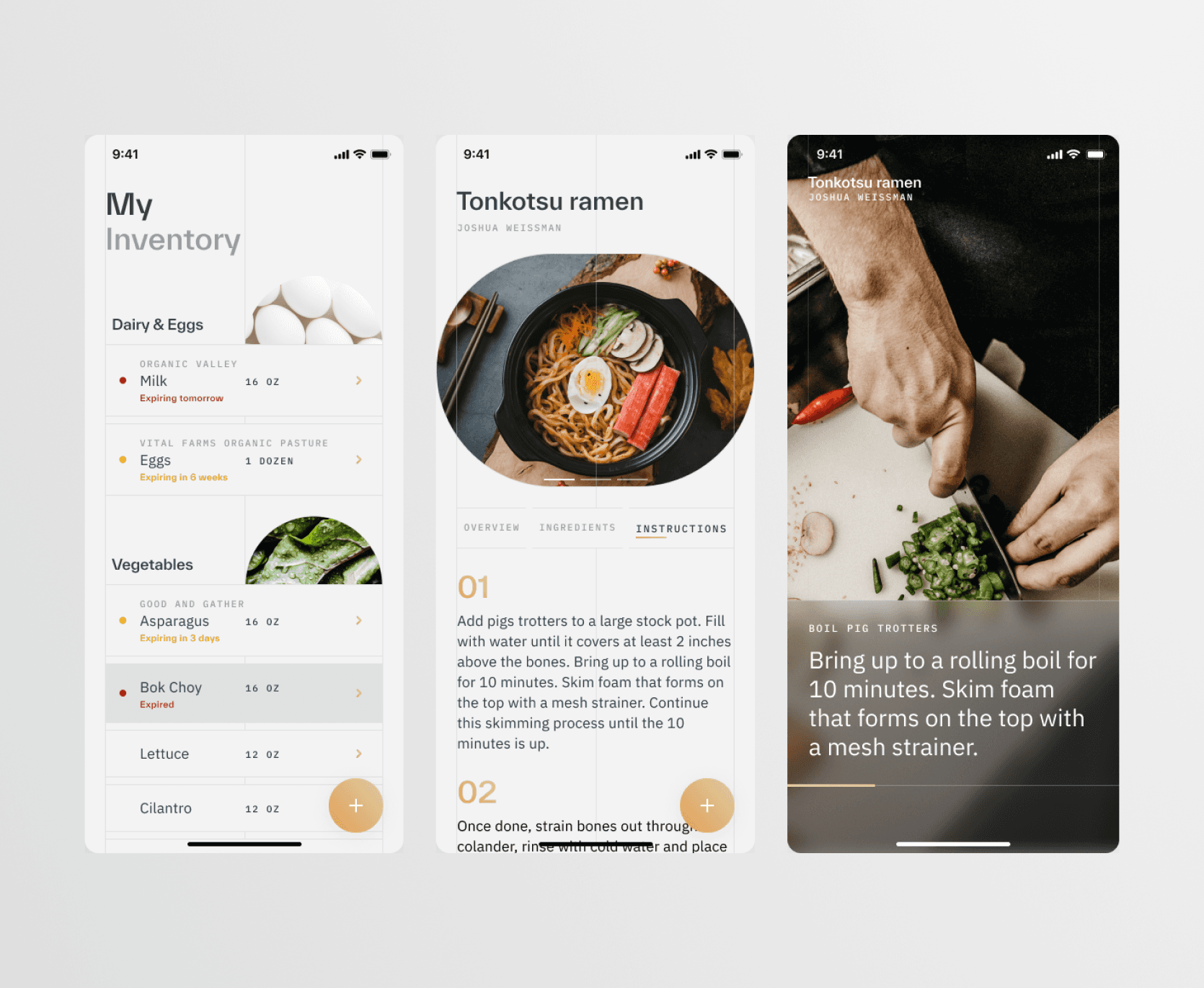
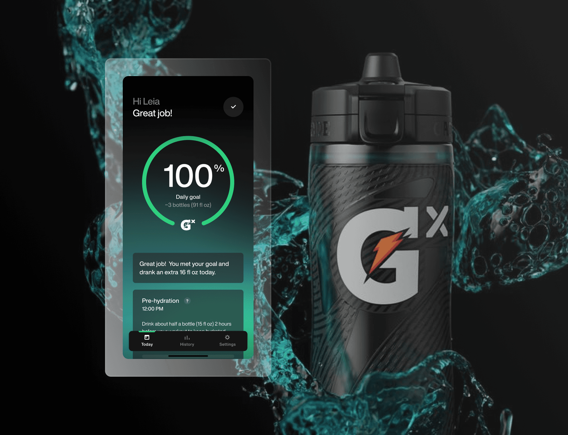
The key screens above are an example of some early visual mockups. They capture the feeling and essence of the brand well but did not scale to the tasks and constraints we had at hand.
Tensions we had to resolve:
Gridlines could lead to complex front-end hacks to make it look right
Background blur is intensive computationally and might be a battery drain for users
Muted greys cause usability issues when thinking about high contrast
Complex visual assets will cause a bottle neck in designing screens
Outcome
A great design system is one that is serves all parties
Many different stakeholders and parties had to use this design system. There were shifts that had to be made to accommodate technical feasibility, design sensibility, and overall speed of scalability. We knew this had to be an MVP to showcase key features, but didn't want to lose some of the visual ingenuity that was explored.
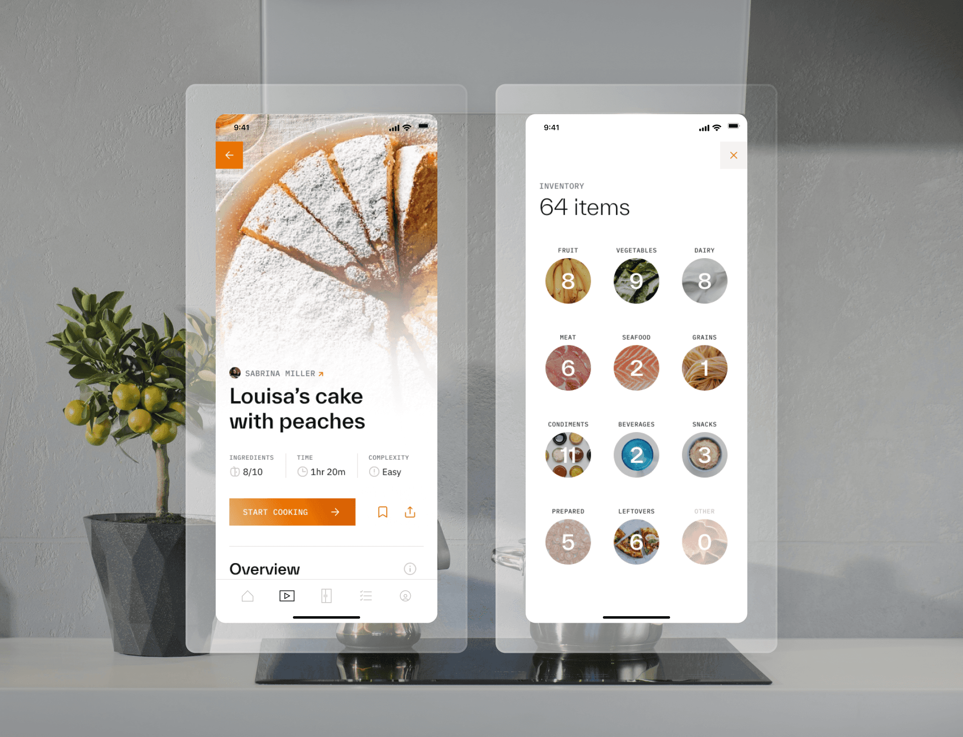
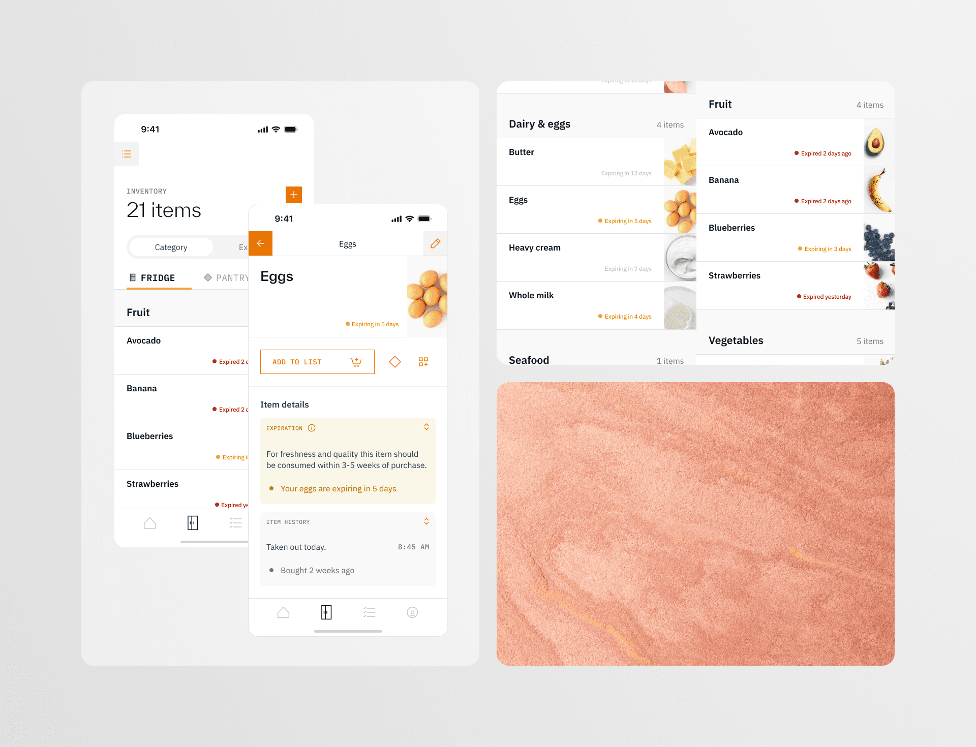
We had to make some quick decisions and compromises to the visual direction but still, we landed on a system we were proud of, showcased above.
In the end we went with:
A white background to more closely mimic the feeling of opening a fridge and seeing fresh ingredients back-lit by the interior lighting
Warm orange as our active color to symbolize warmth and the use of fire in the kitchen
More images of ingredients rather than text to inspire home-cooks
Larger text in combination with introducing a darker grey to increase legibilty
As an owner of this design system, I initially presented three visual directions and facilitated feedback from the design team, the technology team, and the client. While managing various contraints, I designed the groundwork for our design system that is still being used today.
MORE PROJECTS
