Gatorade Smart Bottle
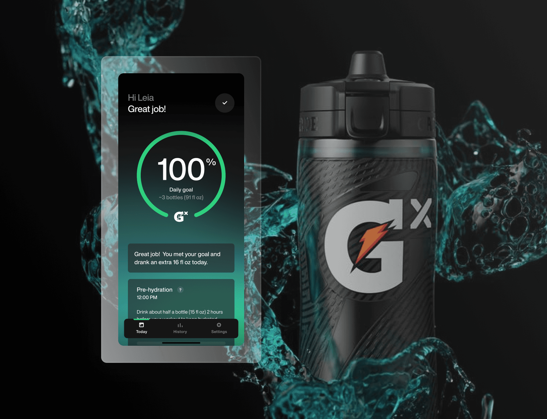
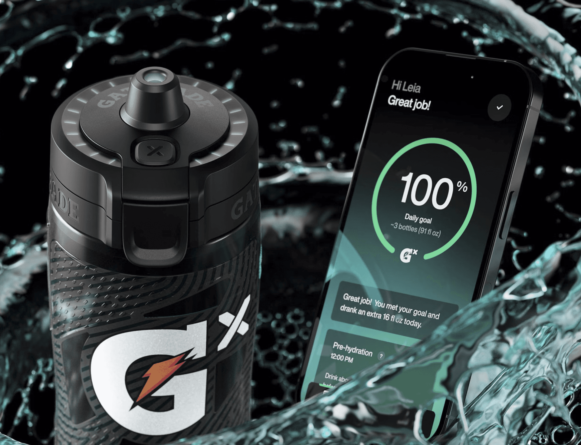
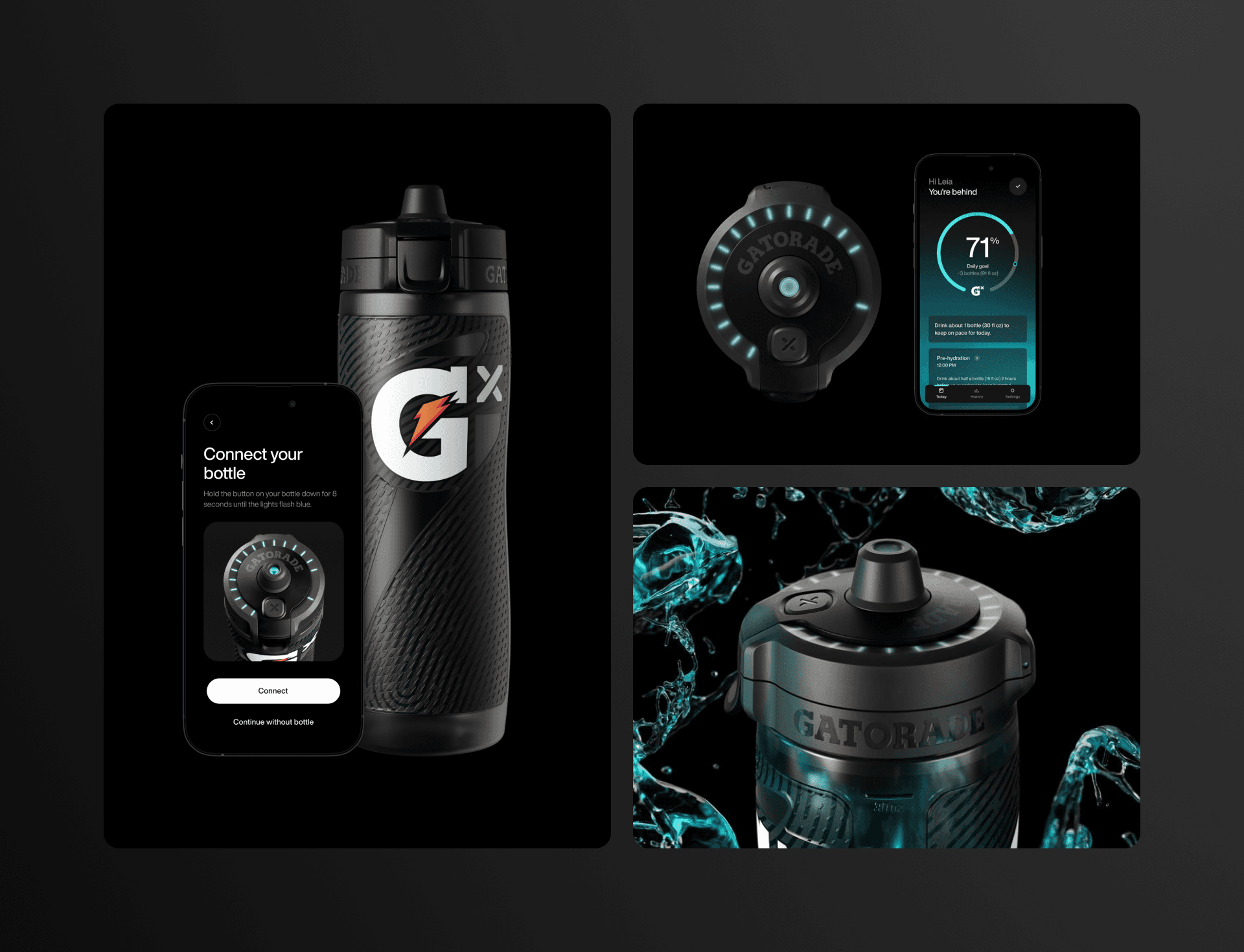
The Gatorade Smart Gx Bottle is a squeeze bottle with built in sensors designed to help athletes track their daily hydration. We were tasked with piloting their product and crafting their digital experience. As the lead designer on this project, I was in charge of designing intuitive flows, screens, and making the visuals feel real for our participants.
Service
UI Design, UX Design, Design Systems, Mobile
Industry
Connected Tech, Fitness
Timeline
2022
Honoree for best interaction design
We designed the pilot experience to get authentic responses from consumers
For context, Gatorade already had the bottle form factor and key technical specifications of how the connected technology would work. The bottle houses sensors that detect how much hydration an athlete is getting over the course of a day. Our task was to craft a compelling digital companion app to serve as the Bluetooth bridge but also guide them through the experience of using the bottle.
Our goal for this pilot was to give consumers a market-like experience. We didn't want it to feel like it was obviously a prototype, to feel unpolished, or feel unfinished. We wanted to elicit consumer feedback for the product as if Gatorade had released it already and give Gatorade actionable insights to ready them for release.
Approach
Build a modular system fast
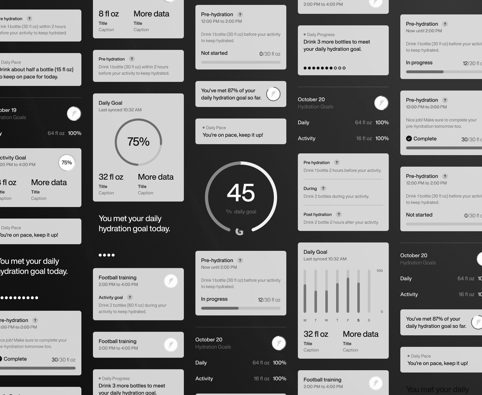
When we started this project, we had light brand guidelines (colors, typeface, logos) and some key tech features we wanted to test (hydration tracking, bluetooth pairing, historical data). When designing components, we decided to build a modular card system that would be easy to swap out and change on the go as needed. For a pilot experience, it was important to have flexibility and speed to be able to make decisions on the spot.
Approach
Experience first, visuals later
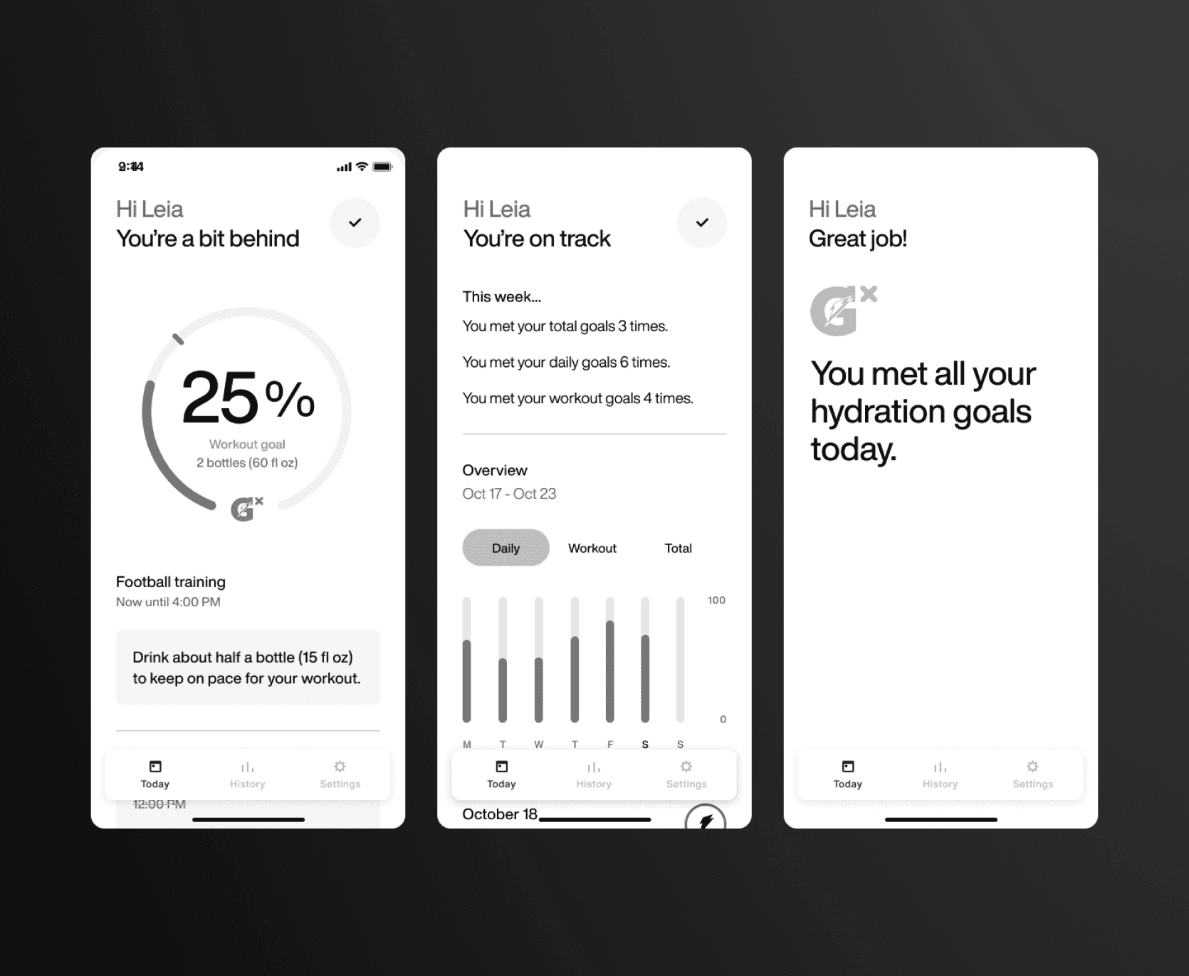
A key factor to success was saving visual design for late in the process. We stayed in greyscale wireframes to focus on the flow and UX of each key tech feature before looking at colors. This really helped streamline feedback from the rest of the team and our clients at Gatorade. By focusing on the experience, we gave the developers more time to implement backend without having to worry about frontend.
Outcome
Highlight key features
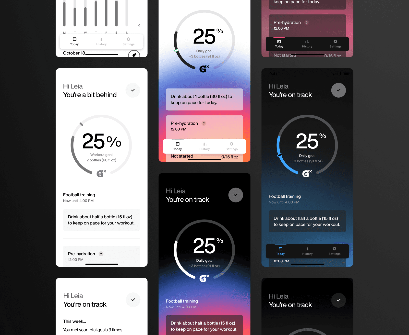
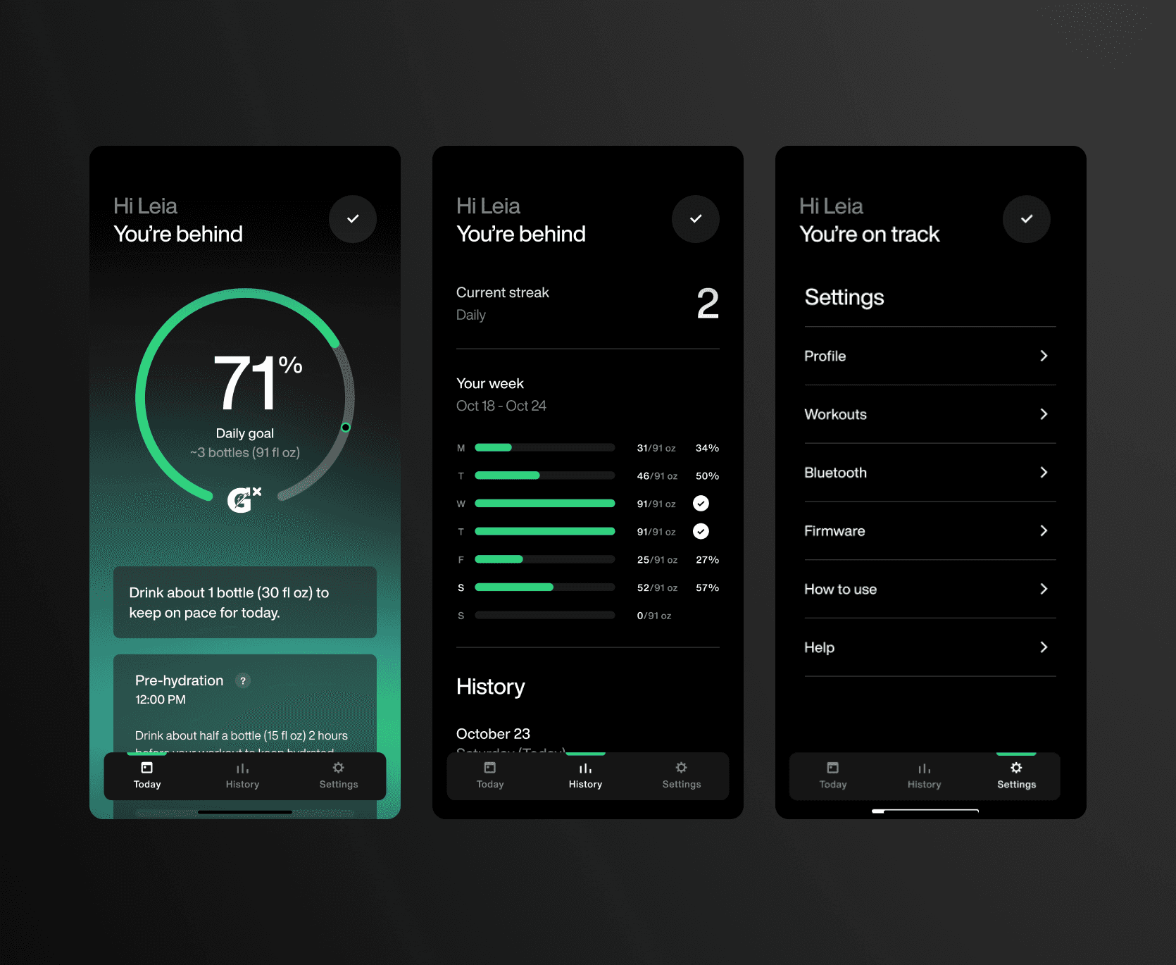
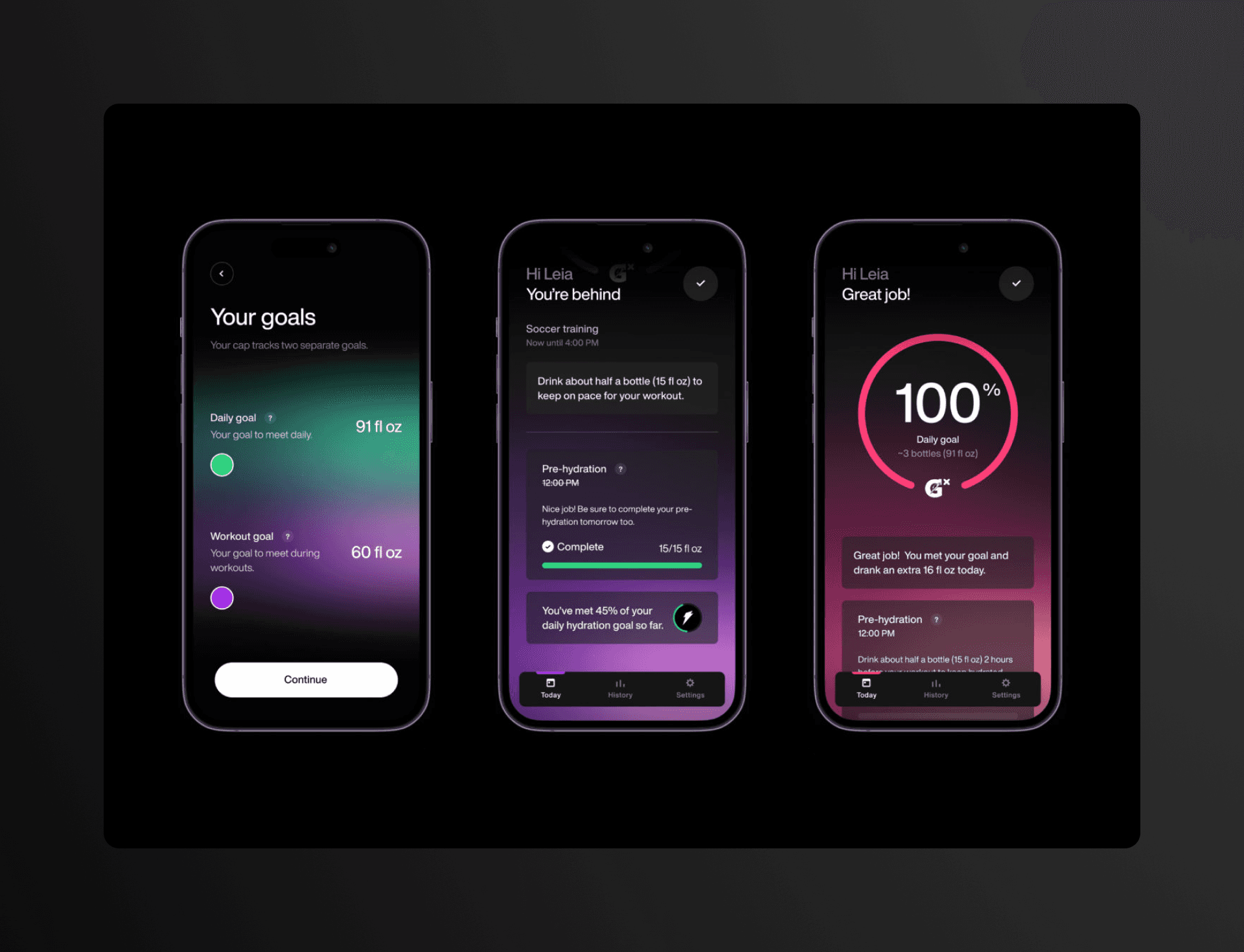
Once wireframes were agreed upon we used visual design to highlight key technical features. I designed a set of gradients that were used to dynamically represent hydration over the course of the day. We also used an active color to bring more attention to data and numbers while letting the rest of the interface be minimal. We ended up with a set of screens that we tested with 15+ participants.
Key learnings from the pilot:
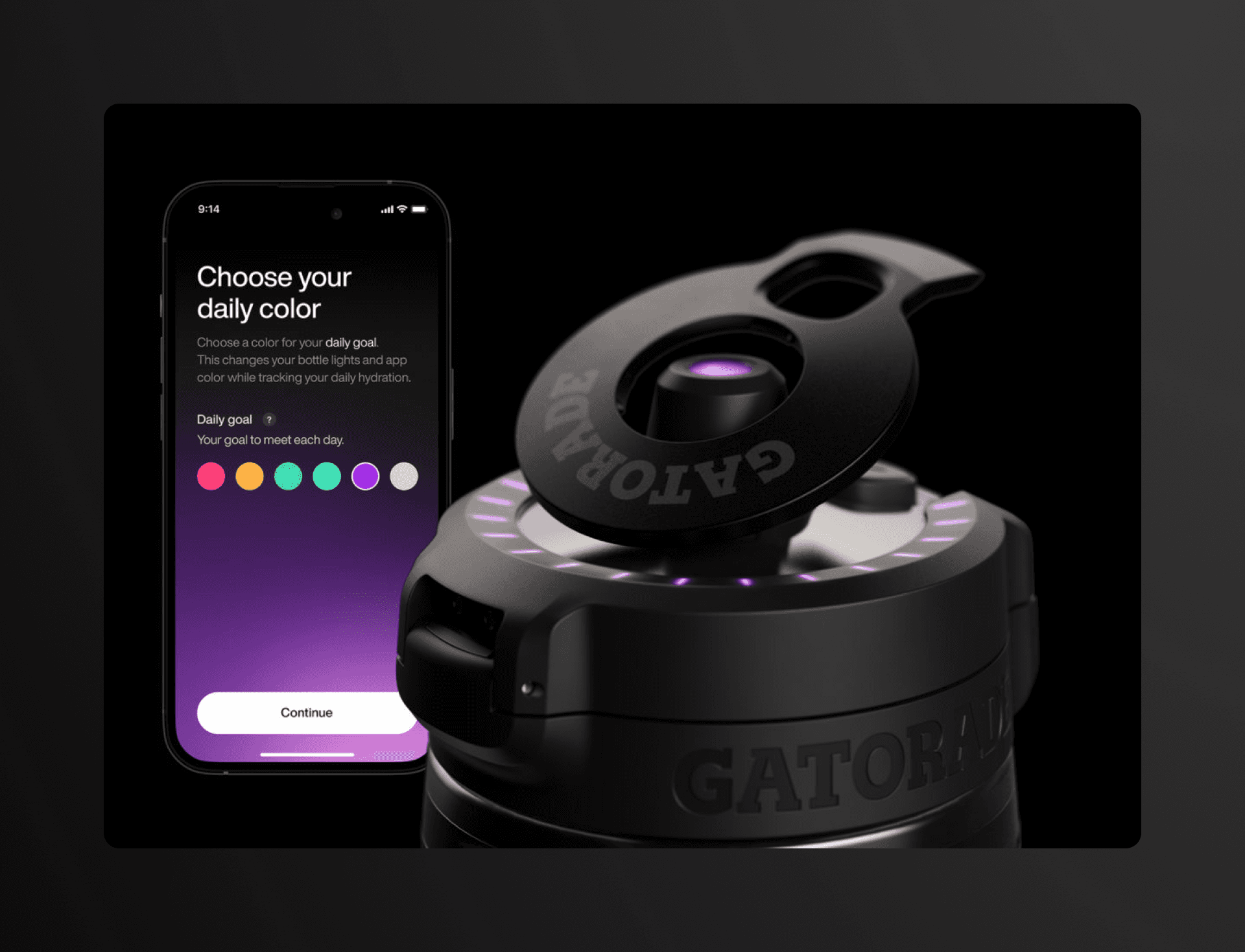
Consumers feel more attached to a product they can customize - there was an instant moment of joy once consumers saw the bottle light up and change colors. We heard from multiple participants that they wanted to be able to choose and change the colors to match their style. In the second round of testing we added a feature to be able to change the colors of the bottle lights which would also change the color of the app gradients.
Consumers learn by doing - the more text and screens we showed in the onboarding actually detracted from the experience of learning how to use the bottle. Once consumers took their first sip and saw the UI and bottle react they understood it immediately.
Consumers want more control - consumers wanted a way to use the app without the bottle to track beverages they were drinking that weren't recorded. It was important for them to see their data in the app.
These learnings helped shape Gatorade's final product.
I led the design for the pilot experience of the Gatorade Smart bottle. As part of this engagement, I designed flows that highlighted key features and worked with a developer to bring those to life. We were able to quickly implement and deliver a real experience for our participants which led to learnings that we distilled into actionable insights for Gatorade to implement.
MORE PROJECTS
